

Riverside Speech Pathology
Project Spotlight
Professional care, delivered with warmth.
Riverside Speech Pathology provides speech and language support for clients of all ages. The brand needed to feel professional and trustworthy, while remaining friendly and approachable for families and children.
-
Create an identity that balances clinical credibility with warmth, and works across signage, forms, digital platforms, and everyday client communication.
-
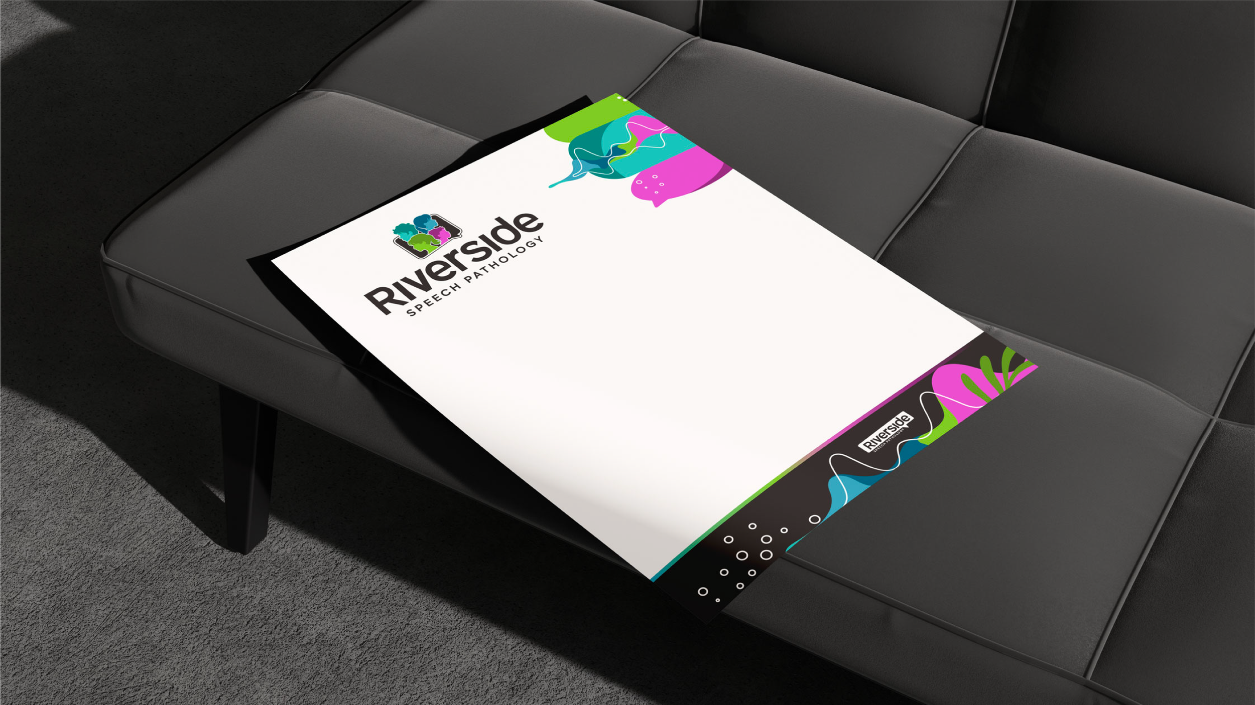
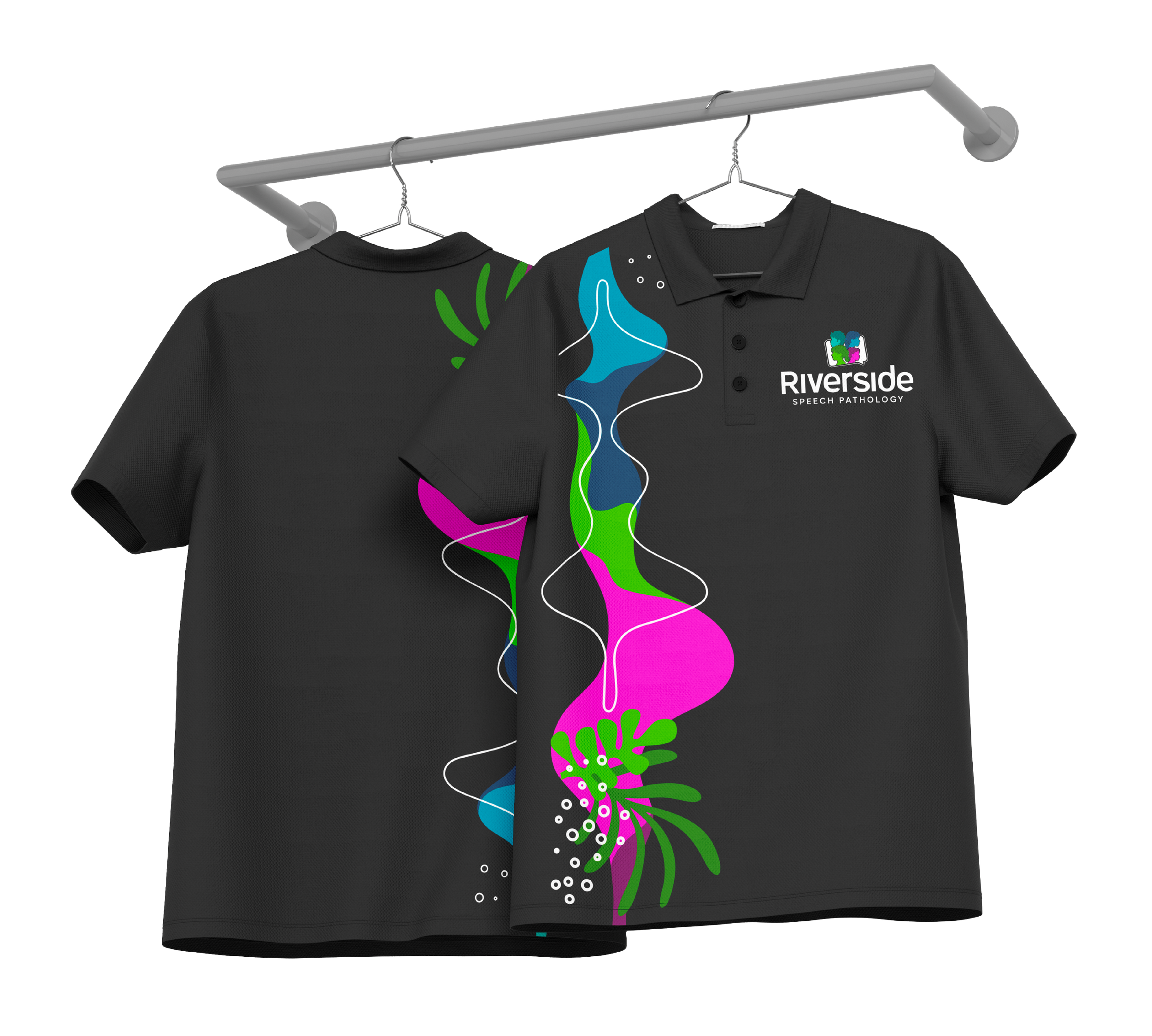
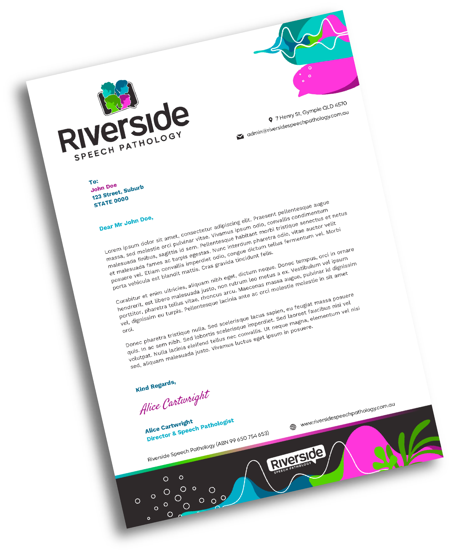
Designed a clean, friendly logo that feels confident and welcoming
Developed a calming colour palette suited to both children and adults
Created simple supporting graphics linked to communication and growth
Designed front-of-building signage inspired by sound waves
Produced print and digital assets for daily clinic use
-
The refreshed brand gives Riverside a clear, approachable presence that reflects their care and expertise. The sound wave signage creates a strong visual link to speech and communication, making the clinic instantly recognisable in the local area.