
PURE POTTERY
Project Spotlight
Support that feels like sunshine.
Sunnyside Support is a people-first support brand built around warmth, trust and community connection. The brand reflects a positive, reassuring approach to care, creating a professional yet welcoming presence across every touchpoint.
-
Sunnyside Support needed a brand that felt warm, trustworthy and people-focused, while still presenting professionally across digital and service environments.
The goal was to create a brand that felt optimistic and reassuring, an identity clients and families could instantly feel safe and supported by.
-
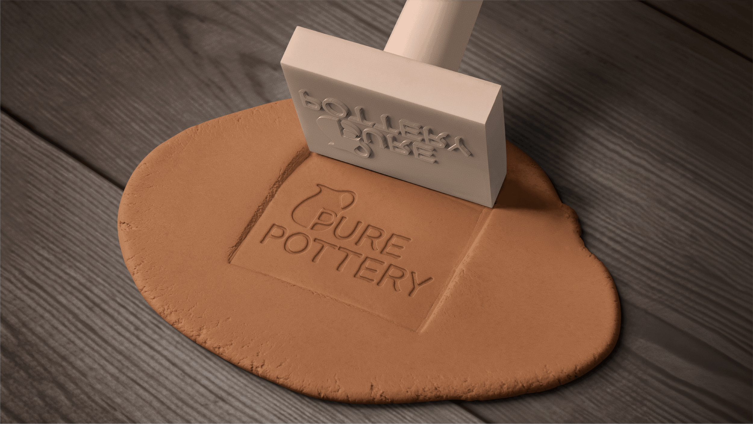
We developed a complete brand identity system to support Sunnyside as they grow.
This included brand strategy, logo design, colour palette, typography, supporting graphics and brand guidelines. The identity centres around sun rays, community and support, symbolising warmth, hope and empowerment.
We created a flexible system designed to work consistently across digital, print, uniforms and marketing.
-
Sunnyside now has a brand that feels approachable, uplifting and professional, reflecting the genuine care they provide every day.
The new identity gives the team confidence in how they show up, while creating a strong foundation for future growth and connection with their community.